Appendix A: Tutorials
This topic provides a step-by-step guide to developing widgets, including steps on how to localize widgets, etc.
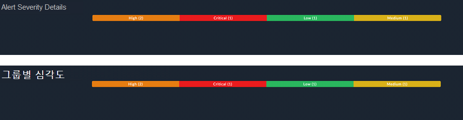
Sample widget to group records in a module by severity
The requirement of the sample widget is to first group a module's records for example, the 'Alerts' module, according to severity and then display the total number of records in each severity in various views or formats such as the List, Table, or Stacked views. Following is a sample screenshot of how this widget will be displayed in various views, i.e., the List, Tabular, and Stacked Bar Views: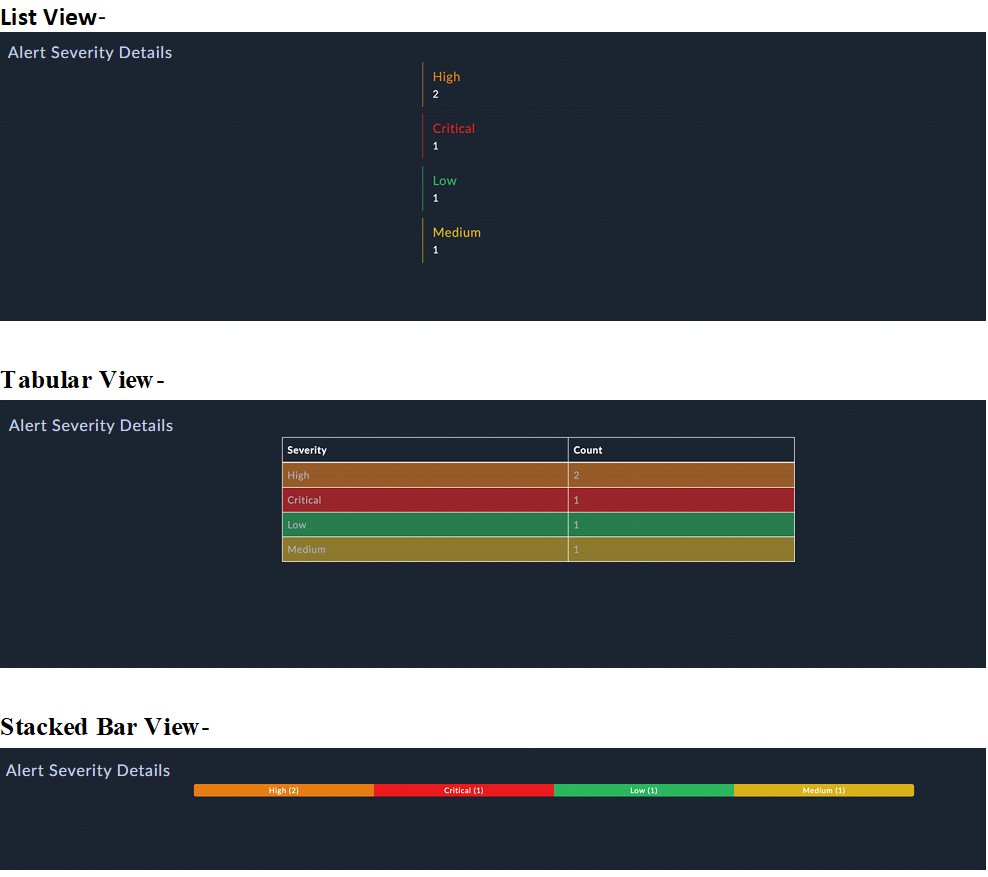
To create this widget, log into FortiSOAR and click on Content Hub. Next, click the Create tab and select New Widget from the Create drop-down list. This opens the 'Widget Building Wizard'. Enter the appropriate details for the widget such as, the name and title of the widget (Severity by Group), the pages on which you want to display the widget (Dashboard), and click Create Widget. For details on the 'Widget Building Wizard', see the "User Guide" in the FortiSOAR Product Documentation.
The values entered during this initial configuration are used to generate the widget's info.json file. Additionally, the following default files are added with the info.json files:
view.htmledit.htmlview.controller.jsedit.controller.jswidgetUtility.service.js(from release 7.5.0 onwards). For more information, see the Creating a widget with multilingual support topic.localesfolder, containing files for various locales (languages), such asen.json,ko.json, etc. (from release 7.5.0 onwards). For more information, see the Creating a widget with multilingual support topic.
The contents of an info.json file are explained in the Overview chapter.
Sample info.json file for the 'Severity by Group' widget:
{
    "name": "severityByGroup",
    "title": "Severity By Group",
    "subTitle": "Module's Severity By Group",
    "version": "1.0.0",
    "publishedDate": 1696317032,
    "releaseNotes": "unavailable",
    "metadata": {
        "description": "Test Description",
        "pages": [
            "Dashboard"
        ],
        "certified": "No",
        "publisher": "",
        "compatibility": [
            "7.4.3", "7.4.2"
        ]
    },
    "development": true
}
Widget Development Steps
The first step in widget development is to determine the required inputs, which are the inputs that need to be provided by the user to display the widget. These inputs are set in the edit.html file, which contains HTML tags and DOM elements. The edit.html file can contain elements such as, input boxes, drop-downs, checkboxes, radio buttons, and icons. Following is a sample screenshot of the editable view of the widget form: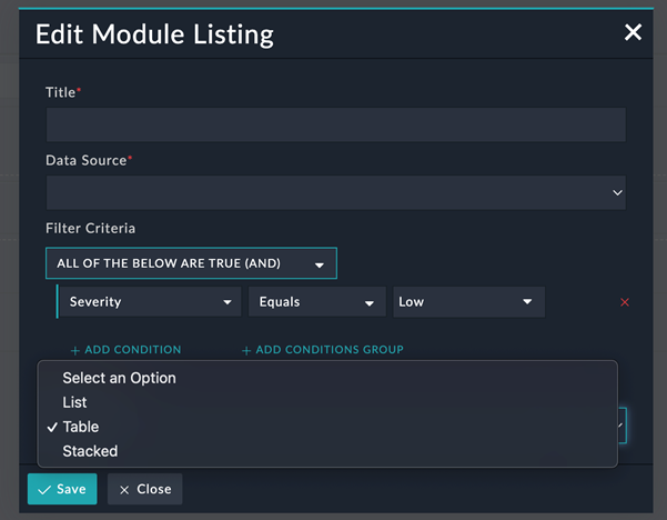
To develop this form, you need to update the default files, i.e., the edit.html, view.html, edit.controller, and view.controller as described in the following sections.
Editing the edit.html file
Title: To create an input field for users to enter the widget title, use the following code snippet:
<div class="form-group" data-ng-class="{ 'has-error': editWidgetForm.title.$invalid && editWidgetForm.title.$touched }">
    <label for="title" class="control-label">Title<span class="text-danger">*</span></label>
    <input id="title" name="title" type="text" class="form-control" data-ng-model="config.title" required>
    <div data-cs-messages="editWidgetForm.title">
    </div>
</div>
The value entered by users is assigned to config.title, which is used in the view.html.
Data Source list: To create a Data Source list for the user to select the module whose data the widget needs to displayed, use the following code snippet:
<div class="form-group"
    data-ng-class="{ 'has-error': editWidgetForm.resource.$invalid && editWidgetForm.resource.$touched }"
    data-ng-if="modules">
    <label for="resource" class="control-label">Data Source<span class="text-danger">*</span></label>
    <select name="resource" id="resource" class="form-control"
        data-ng-options="module.type as module.name for module in modules" data-ng-model="config.resource"
        required data-ng-change="loadAttributes()">
        <option value="">Select an Option</option>
    </select>
    <div data-cs-messages="editWidgetForm.resource"></div>
</div>
To load the all the modules from the application to the widget and populate the module-specific fields in the Filter section, once users select a module, use functions added to the edit.controller file.
Filter Criteria: Once users select a module from the Data Source field, module-specific fields are displayed in the 'Filter Criteria':
<div class="form-group" data-ng-if="config.resource">
    <label for="resource" class="control-label">Filter Criteria</label>
    <div data-cs-conditional data-mode="'queryFilters'" data-enable-nested-filter="enableNestedFilter"
        data-fields="params.fields" data-ng-model="config.filters" data-form-name="'editWidgetForm'"
        data-parent-form="editWidgetForm" data-reset-field="params.fields"></div>
</div>
Widget View: To create a list of 'Views' (List, Table, or Stacked) for the user to select how the data should be rendered, use the following code snippet:
<div class="form-group"
    data-ng-class="{ 'has-error': editWidgetForm.widgetView.$invalid && editWidgetForm.widgetView.$touched }">
    <label for="widgetView" class="control-label">Widget View<span class="text-danger">*</span></label>
    <select name="widgetView" id="widgetView" class="form-control"
        data-ng-options="view as view for view in widgetView" data-ng-model="config.widgetView" required>
        <option value="">Select an Option</option>
    </select>
    <div data-cs-messages="editWidgetForm.widgetView"></div>
</div>
Editing the edit.controller file
Populating the Data Source field requires the list of modules. To load all the modules from the application to the widget, use the loadModules function in the edit.controller file:
function loadModules() {
	appModulesService.load(true).then(function (modules) {
		$scope.modules = modules;
	});
}
Once users select a module from the Data Source field, module-specific fields need to be populated in the Filter section:
function loadAttributes() {
    var entity = new Entity($scope.config.resource);
    entity.loadFields().then(function () {
        $scope.params.fields = entity.getFormFields();
        angular.extend($scope.params.fields, entity.getRelationshipFields());
        $scope.params.fieldsArray = entity.getFormFieldsArray();
    });
}
To populate the Widget View field, use the following code snippet:
$scope.widgetView = ['List', 'Table', 'Stacked'];
Editing the view.controller file
To fetch data as per the configuration provided by the user in the widget form, use the following code snippet:
function severityByGroup100DevCtrl($scope, $http, Query, API, $q, config) {
    $scope.config = config;

    function fetchData() {
        getResourceAggregate().then(function (result) {
            if (result && result['hydra:member'] && result['hydra:member'].length > 0) {
                $scope.alertSources = result['hydra:member'].filter(function (item) {
                    return item.severity !== null;
                });
                if ($scope.config.widgetView === 'Stacked') {
                    var totalCount = $scope.alertSources.reduce(function (a, b) {
                        return { total: a.total + b.total };
                    });
                    $scope.alertSources.forEach(element => {
                        var _width = (element.total) / totalCount.total * 100;
                        element.progressBarWidth = _width;
                    });
                }
            }
        });
    }

    function getResourceAggregate() {
        var defer = $q.defer();
        var queryObject = {
            sort: [{
                field: 'total',
                direction: 'DESC'
            }],
            aggregates: [
                {
                    'operator': 'countdistinct',
                    'field': '*',
                    'alias': 'total'
                },
                {
                    'operator': 'groupby',
                    'alias': 'severity',
                    'field': 'severity.itemValue'
                },
                {
                    'operator': 'groupby',
                    'alias': 'color',
                    'field': 'severity.color'
                }
            ],
            filters: [$scope.config.filters]
        };
        var _queryObj = new Query(queryObject);
        $http.post(API.QUERY + $scope.config.resource, _queryObj.getQuery(true)).then(function (response) {
            defer.resolve(response.data);
        }, function (error) {
            defer.reject(error);
        });

        return defer.promise;
    }

    fetchData();
}
The 'Query' object contains the query parameters along with the config filters to fetch data.
Editing the view.html file
The View.html file contains HTML tags and DOM elements according to the widget's UX. It consists of divs, images, svgs, or Angular libraries such as charts.
Title: To render the input field where the user can enter the title of the widget, use the following code snippet:
<div class="padding-right-0 padding-left-0 widget-dashboard-title-width"
    data-ng-class="(page === 'dashboard' || page === 'reporting') ? 'widget-dashboard-title-width' : 'widget-title-width'">
    <h5 class="margin-top-0 margin-bottom-0 text-overflow ng-binding">{{ config.title }}</h5>
</div>
config.title renders the value as the title on the widget.
Widget View: To render data in the widget as per the user's selection, i.e., in the List, Table, or Stacked views, use the following code snippet:
<div data-ng-hide="collapsed">
    <div class="margin-left-15" ng-if="config.widgetView === 'List'">
        <div class="container width-30">
            <div class="list-group">
                <div class="list-group-item margin-bottom-md" style="border-left: 1px solid {{element.color}};"
                    data-ng-repeat="element in alertSources">
                    <h4 class="list-group-item-heading" style="color: {{element.color}};">{{element.severity}} </h4>
                    <p class="list-group-item-text">{{element.total}}</p>
                </div>
            </div>
        </div>
    </div>
    <div class="margin-left-15" ng-if="config.widgetView === 'Table'">
        <div class="container width-50">
            <table class="table">
                <thead>
                    <tr>
                        <th>Severity</th>
                        <th>Count</th>
                    </tr>
                </thead>
                <tbody>
                    <tr data-ng-repeat="element in alertSources" data-ng-style="{'background-color':element.color}">
                        <td>{{element.severity}}</td>
                        <td>{{element.total}}</td>
                    </tr>
                </tbody>
            </table>
        </div>
    </div>
    <div class="margin-left-15" ng-if="config.widgetView === 'Stacked'">
        <div class="container">
            <div class="progress">
                <div data-ng-repeat="element in alertSources" class="progress-bar" role="progressbar"
                    style="width:{{element.progressBarWidth}}%;background-color:{{element.color}};">
                    {{element.severity}} ({{element.total}})
                </div>
            </div>
        </div>
    </div>
</div>
If you want to move the service logic to a separate file, you can create a <name>.service.js file in the widget 'asset' directory, and inject the service in the controller files to utilize its methods.
Creating a custom non-modal widget with an interactive background
You can create a non-modal widget that is accessible across the FortiSOAR application.
|
Widgets that are launched using a button and do not need to be configured to work should be made non-modal. |
To create a non-modal widget, you must add the following to the widget's info.json file, save the changes, and publish the widget:
"contexts": [
	"drawer"
]
Widgets can be enabled for multiple specific contexts, such as 'drawer' and 'playbook designer':
"contexts": [
	"drawer",
	"pb_designer"
]
In this case, the widget's logo is accessible from anywhere in FortiSOAR when using the 'drawer' context and as an icon in the playbook designer. The 'drawer' and the icon in the 'playbook designer' can both be used to launch the widget.
When you install a widget with a 'drawer' context, it will show up in a drawer with the display name ('AI Assitant' in the following image) and logo that match the details you provided when the widget was developed. A default widget icon is shown if the logo is not specified.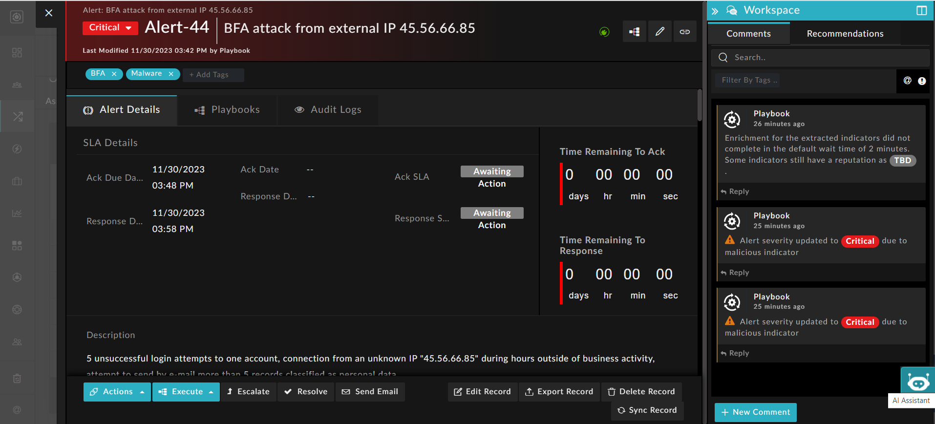
When users click the logo, the widget is launched as per the configuration provided when the widget was created. Therefore, it is imperative to make non-modal just those widgets that do not require configuration to function.
You can also customize how the widget is launched and viewed by adding properties in the view section of the info.json. For example, you can choose to launch a widget with an interactive background. Having an interactive background enables users to optimally perform their tasks in their current context.
The various properties that can be added to the view section are:
- To assign a name to a widget, use the
"displayName"property. For example, if you want to name your widget 'FortiAI', add"displayName" : "FortiAI".
If you do not provide a"displayName"for the widget, it will be displayed with only its logo. - To have a fully functional background when a widget is opened, add
"popup": custom. If you do not specify thepopupproperty or set to anything other than 'custom', the widget will remain modal, meaning it will have a non-interactive background. - To make the widget draggable, add
"draggable": trueOnly widgets that have an interactive background, i.e., those that have
"popup": customset, should be made draggable. If 'popup' is not added in the 'view' section or if it is set to anything except 'custom', then the previous version of the FortiSOAR widget is launched with a blurred background. Since FortiSOAR widgets were not draggable in previous iterations, this property will be ignored.
Also note that the 'popup' and 'draggable' properties are ignored if a widget is not launched in the 'drawer'. - To enable the widget to be visible as a 'drawer' on specific pages in FortiSOAR, use the
enableForproperty:"enableFor": [
"main.playbookDetail",
"main.modules.list",
"viewPanel.modulesDetail",
"main.dashboard"
]
This will enable the widget in a drawer in the playbook detail page, dashboards page, and the listings and details pages for all the modules in FortiSOAR.
Once you add the required properties to the view section of the info.json file, save the file and publish the widget.
Following is an example of adding properties in the info.json file to enable a widget named "FortiAI" in a 'drawer' on the playbook designer and detail page of the modules, with an interactive background and draggable:
	"contexts": [
		"drawer"
	],
	"view": {
		"popup": "custom",
		"draggable": true,
		"displayName": "FortiAI",
		"enableFor": [
			"viewPanel.modulesDetail",
			"main.playbookDetail"
		]
	},
Following is an example of how a widget is displayed in the detail view of an alert record with its interactive background and draggable properties enabled: 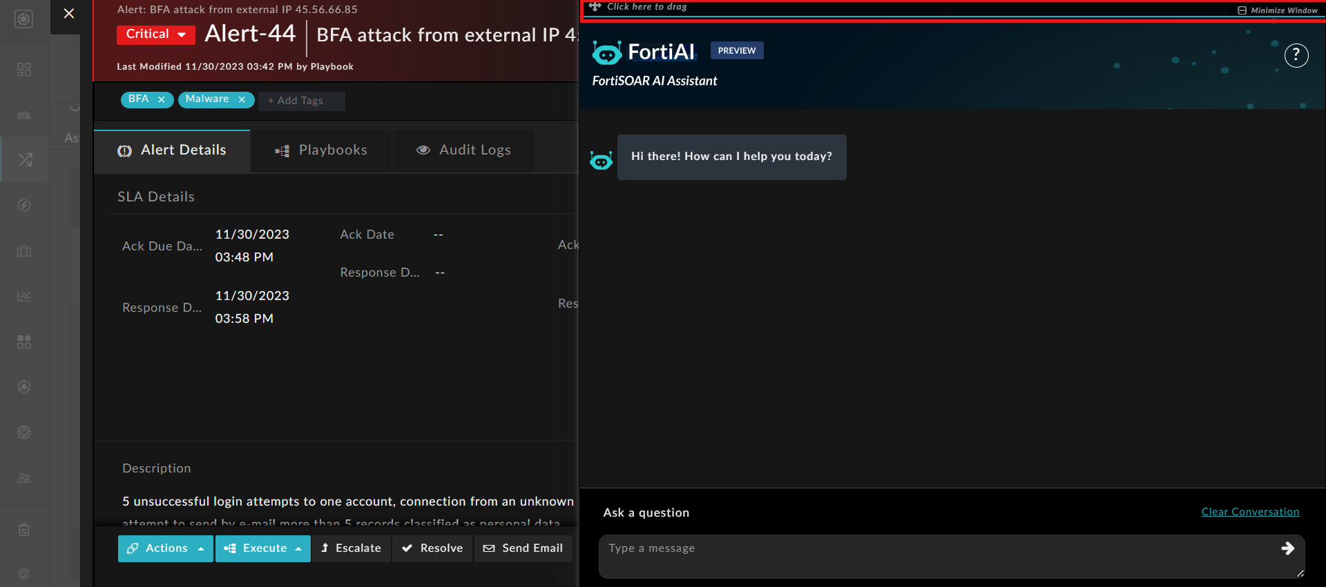
Creating a widget with multilingual support
In FortiSOAR release 7.5.0, support has been added to support multiple languages. Administrators and users can now choose the language in which they want their FortiSOAR instance to be displayed by changing the language settings in the 'General' tab of the 'System Configuration' page and 'User Profile' page. For more information, see the System Configuration chapter in the "Administration Guide" and the Overview chapter in the "User Guide."
NOTE: Preview of a widget will not work on function on releases before 7.4.1 if your widget is localized.
To enable multilingual support, starting from release 7.5.0 the widgetUtility.service.js file is automatically included in the widgetAssets/js folder, and the JSON files used for language translation are added to the widgetAssets/locales folder, when creating a widget. For the directory structure of a widget, see the Development process chapter.
The current release supports the following languages:
| Language | Name of the locale file |
|---|---|
| English | en.json |
| Japanese | ja.json |
|
Korean |
ko.json |
|
Simplified Chinese |
zh_ch.json |
Each locale file follows a key-value structure, with the translation key and the corresponding value representing the translated text that will be used in the widget.
For example, let's consider the 'Severity by Group' widget. The widget's name (API key) is "severityByGroup" , so the en.json file contains this data in the following format:
{
    "severityByGroup": {
        "KEY_NAME": ""
    }
}
You can add "severityByGroup" as its KEY NAME: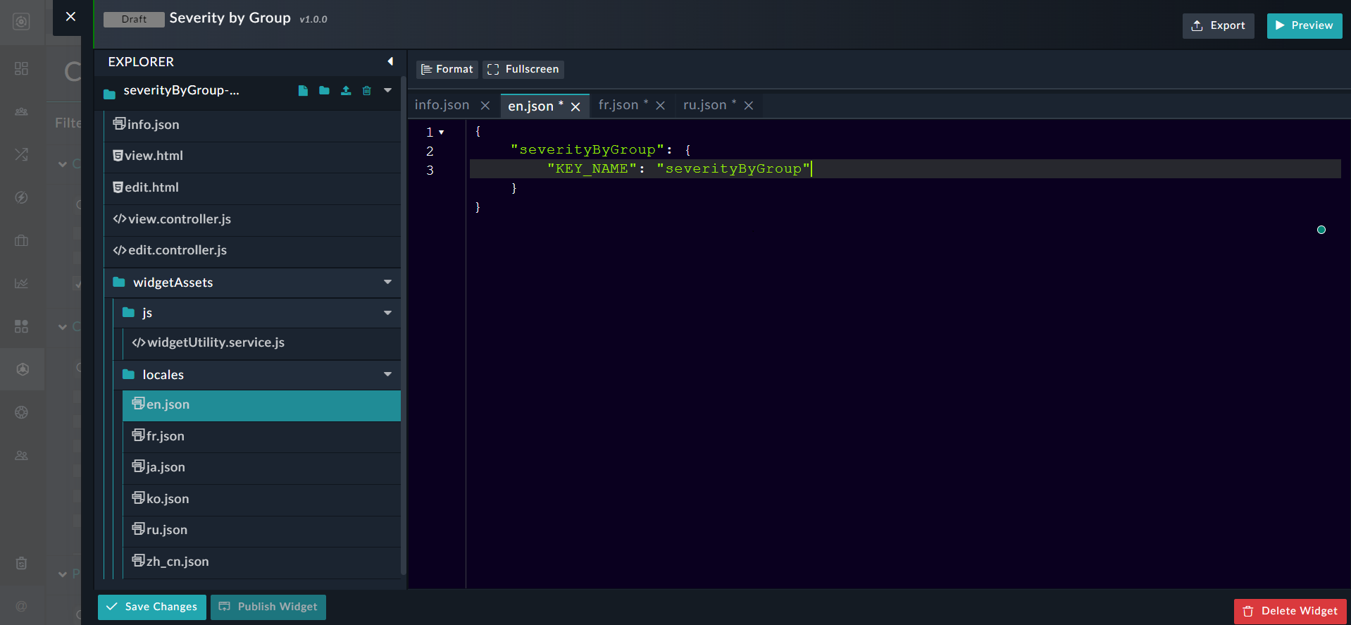
Similarly, you can edit the ko.json file to add the value of the "severityByGroup" API key in Korean: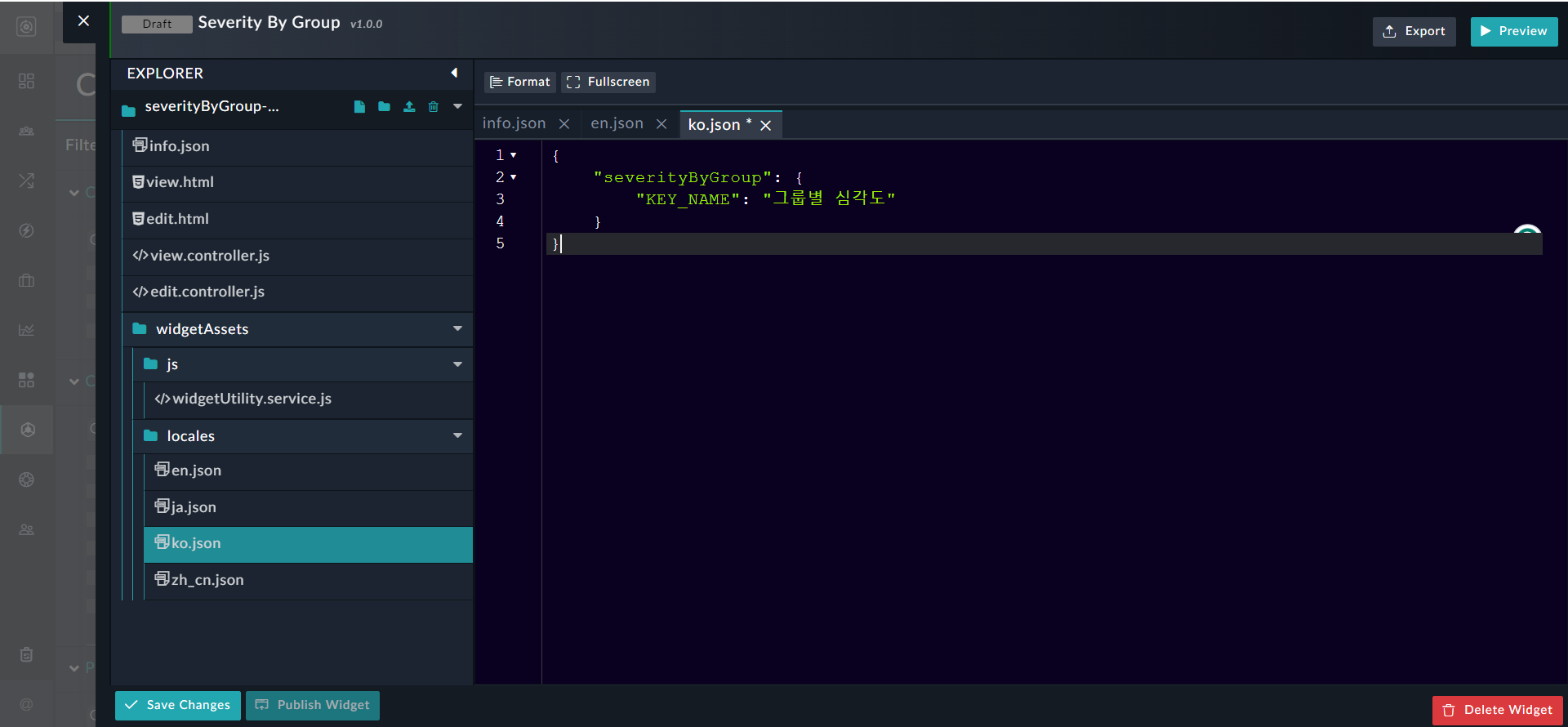
You can edit all the JSON files in a similar manner to translate all the keys of the widget into the required language.
The widgetUtility.service.js is responsible for handling translations in widgets and includes three main functions: checkTranslationMode, translate, and getWidgetNameVersion.
The checkTranslationMode function checks if the translation service is included, and if not, injects the translation service into the widget.
function checkTranslationMode(widgetName) {
  widgetNameVersion = widgetName;
  try {
    translationService = $injector.get('translationService');
  } catch (error) {
    console.log('"translationService" doesn\'t exists');
  }
  var defer = $q.defer();
  translationServiceExists = typeof translationService !== 'undefined';
  if (!translationServiceExists) {
    var WIDGET_BASE_PATH;
    try {
      WIDGET_BASE_PATH = $injector.get('WIDGET_BASE_PATH');
    } catch (e) {
      WIDGET_BASE_PATH = {
        INSTALLED: 'widgets/installed/'
      };
    }
    $http.get(WIDGET_BASE_PATH.INSTALLED + widgetNameVersion + '/widgetAssets/locales/en.json').then(function(enTranslation) {
      translationData = enTranslation.data;
      defer.resolve();
    }, function(error) {
      console.log('English translation for widget doesn\'t exists');
      defer.reject(error);
    });
  } else {
    defer.resolve();
  }
  return defer.promise;
}
The translate function returns the translated value of the key passed as a parameter.
function translate(KEY, params) {
  if (translationServiceExists) {
  	return translationService.instantTranslate(KEY, params);
  } else {
    var translationValue = angular.copy(translationData);
    var keys = KEY.split('.');

    for (var i = 0; i < keys.length; i++) {
      if (translationValue.hasOwnProperty(keys[i])) {
        translationValue = translationValue[keys[i]];
      } else {
        translationValue = '';
        break;
      }
    }
    if (params) {
      return $interpolate(translationValue)(params);
    }
    return translationValue;
  }
}
The getWidgetNameVersion function provides the name and version of the widget to the edit.controller.js:
function getWidgetNameVersion(widget, widgetBasePath) {
   let widgetNameVersion;
   if (widget) {
     widgetNameVersion = widget.name + '-' + widget.version;
   } else if (widgetBasePath) {
     let pathData = widgetBasePath.split('/');
     widgetNameVersion = pathData[pathData.length - 1];
   } else {
     toaster.warning({
       body:'Preview is unavailable for widgets that support localization.'
     });
   }
   return widgetNameVersion;
 }
In the edit.controller.js file, edit the _handleTranslations function to evaluate the translation keys. This function checks the translation mode from the widgetUtility service and renders the translated key, {"severityByGroup": {"KEY_NAME": ""}} in our example, on FortiSOAR:
function _handleTranslations() {
  let widgetNameVersion = widgetUtilityService.getWidgetNameVersion($scope.$resolve.widget, $scope.$resolve.widgetBasePath);

  if (widgetNameVersion) {

    widgetUtilityService.checkTranslationMode(widgetNameVersion).then(function () {
      $scope.viewWidgetVars = {
        // Create your translating static string variables here
		module_key: widgetUtilityService.translate("severityByGroup.KEY_NAME")
      };
    });

  } else {
    $timeout(function() {
      $scope.cancel();
    });
  }
}
In the view.controller.js file, edit the _handleTranslations function to evaluate the translation keys.
function _handleTranslations() {
  widgetUtilityService.checkTranslationMode($scope.$parent.model.type).then(function () {
    $scope.viewWidgetVars = {
      // Create your translating static string variables here
	module_key: widgetUtilityService.translate("severityByGroup.KEY_NAME")
    };
  });
}
In the edit.html and view.html files, define how you want to display the translated content:
<div class="modal-body">
    <div>
          Module Name: {{ viewWidgetVars.module_key }}
  </div>
</div>
The _handleTranslations() function checks the translation mode from the widgetUtility service and renders the "severityByGroup.KEY_NAME" on FortiSOAR once you save and publish the widget: