Directives
This topic provides information about the various custom directives that are available for developing widgets.
Field Directive
Overview
The "cs-field" directive dynamically renders fields based on a specified form type. It enforces that the rendered fields are required and binds the value to the ng-model attribute.
Selector to render a field - data-cs-field
Usage
<div data-cs-field="field" data-mode="'add'" data-ng-model=" value" data-size="'small'" data-change-method="changeMethod" data-enable-jinja="true" data-enable-expression="enableExpression" data-allow-add-tag="true"
	data-blur-method="changeMethod" data-ignore-editable="true" data-disabled="disabled" data-use-placeholder="true" data-fields-mapping="fieldsMapping" data-form-name="'fieldForm'">
</div>
Arguments
| Parameters | Definition | Data Type |
|---|---|---|
| Field (Required) |
Field definition for rendering a field.scope.field = new Field({
'name':'password',
'formType': 'password',
'title': 'Password',
'writeable': true,
'validation': {
'required': true
}
});FormType
|
Field |
| ng-mode (Required) |
Used to store/populate the value of a field after it is rendered or changed. | Any value based on field type |
| FieldOptions (Optional) |
Used in ViewPanel SVT to set fields such as linky, readonly, highlightMode etc.
For example, fieldOptions = {linky: boolean, readOnly: boolean, highlightMode: boolean} For multiselect fields, it can also pass options such as, {entity: {module: string, id: string }} |
object |
| UsePlaceholder (Optional) |
Used to enable use of a placeholder in a field. | boolean |
| Size (Optional) |
Size of the field to be rendered. Options can be large, small. | string |
| ChangeMethod (Optional) |
Method to be called after the field value is changed. | function |
| BlurMethod (Optional) |
Method to be called after the blur event of a field. | function |
| FocusMethod (Optional) |
Method to be called after the focus event of a field. | function |
| Disabled (Optional) |
Used to enable or disable a field. | boolean |
| EnableJinja (Optional) |
Used to enable Jinja for a field. | boolean |
| EnableExpression (Optional) |
Used to enable expressions for a field. | boolean |
| Mode (Optional) |
Used to check whether the field is in the 'edit' mode. | boolean |
| fieldsMapping (Optional) |
Used to update the fieldType based on the field mapping. |
object |
Examples
Create an input text field using the field directive:
<div data-cs-field="field" data-ng-model="playbookNote" data-use-placeholder="'Add Version Description'" data-form-name="'playbookVersionForm'"></div>

$scope.field = new Field({
	'name': 'note',
	'formType': 'text',
	'title': 'Note',
	'writeable': true,
	'validation': {
	'required': true
   }
})
The above snippet creates a input text field named "Note":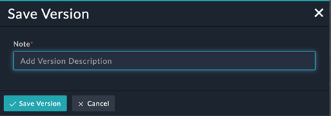
Create a tag field using field directive:
<div data-cs-field="tagsField" data-ng-model="tag" data-use-placeholder="'Add tags'" data-form-name="'playbookVersionForm'"></div>

$scope.tagsField = new Field({
	'name': 'tags',
	'formType': 'tags',
	'title': 'Tags',
	'writeable': true,
	'validation': {
	'required': true
   }
})
The above snippet creates a "tag" field: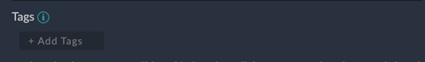
Conditional Filters
Overview
The "cs-conditional" directive dynamically renders conditional fields based on a specified form type. It enforces that the rendered fields are required and binds the value to the ng-model attribute.
Selector to add conditional filters - data-cs-conditional
Usage
<div data-cs-conditional data-enable-nested-filter="enableNestedFilter"
data-fields="params.fields" data-ng-model="config.filters" data-form-name="'editWidgetForm'" data-parent-form="editWidgetForm"
data-reset-field="params.fields"></div>
Arguments
| Parameters | Definition | Data Type |
|---|---|---|
| data-fields (Required) |
Populates the fields to be applied in the filter drop-down.
Fields parameters are mandatory.
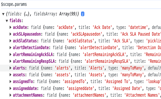 |
Array of an object[Array<Object>] |
| data-ng-model (Required) |
Used to assign the selected filters in the filter criteria.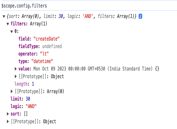 |
Array of an object[Array<Object>] |
| data-enable-nested-filter (Optional) |
Used to allow nested fields in filters. | boolean |
| Template (Optional) |
Used only if a custom template is defined. This parameter is used to render all conditional fields. By default, the built-in template is used, so nothing needs to be specified for this parameter. | HTML template |
| data-form-name (Optional) |
Used to create the current form name in HTML. | string |
| data-reset-name (Optional) |
Used to reset a query if any field passed in this parameter is updated. |
Array of an object |
| data-hide-related-fields (Optional) |
Used to hide related fields. |
boolean |
| data-mode (Optional) |
Used to specify the context of the condition. For example, if it is being used as a query filter or as a trigger condition in workflows. |
string |
| EnableJinja (Optional) |
Used to enable Jinja for a filter field. | boolean |
| EnableExpression (Optional) |
Used to enable expressions for a filter field. | boolean |
Example:
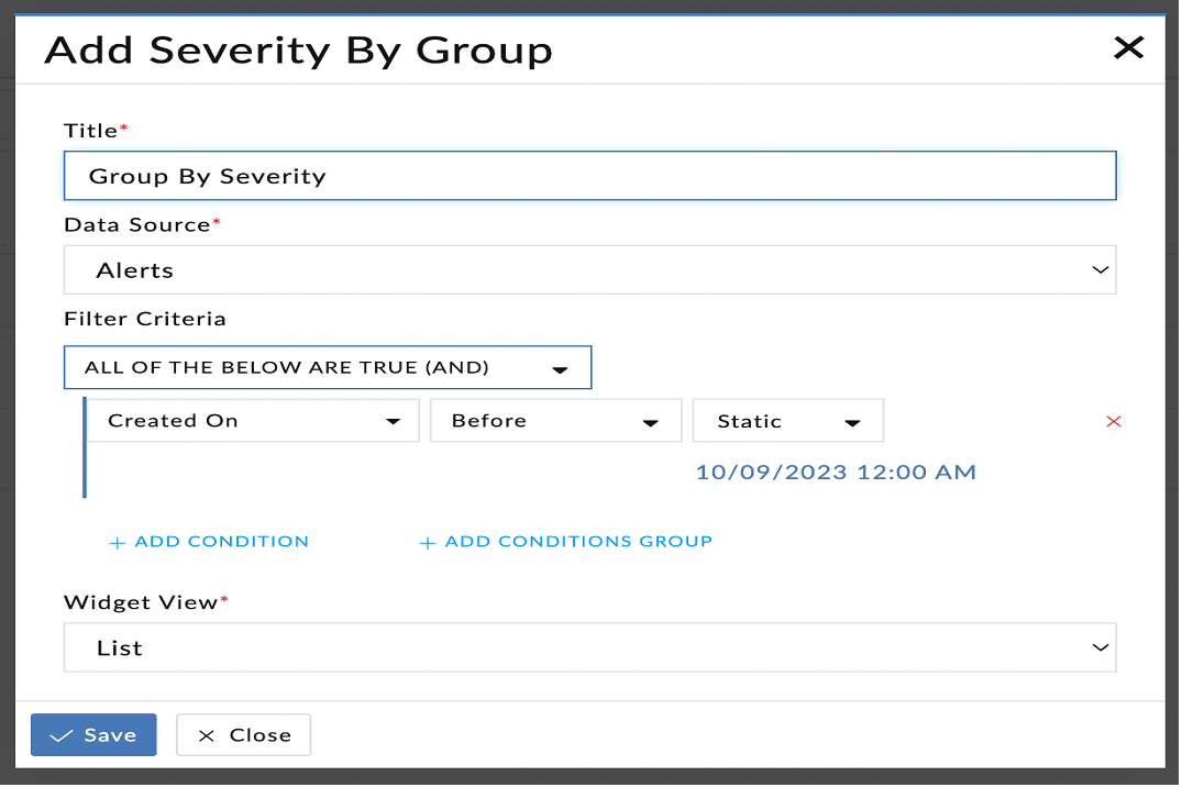
Reference Widget: widget-funnel-chart
data-cs-messages
Overview
The "data-cs-messages" directive displays error messages for specific form fields. It requires the form name and form field as input parameters and works in conjunction with AngularJS's built-in form validation.
Selector to render messages - data-cs-messages
Usage
<div data-cs-messages="auth.login_username"></div>
Arguments
| Parameters | Defintion | Data Type |
|---|---|---|
| data-cs-messages (Required) |
Used to displays error message of a form field. It contains the form name and form field. | string |
Example
Create an form field with input parameters that display information that they are required:
<div class="form-group margin-top-20">
	<label for="login_username" class="form-label font-size-12">Username</label>
	<input class="form-control" type="text" id="username" name="login_username" data-ng-model="credentials.loginid" data-cs-focus autocomplete="off" required>
	<div data-cs-messages="auth.login_username"></div>
</div>
The above snippet creates a form field with required input parameters that display the "This field is required" message.

Grid Directive
Overview
The "cs-grid" directive renders data in a grid format. It relies on the "gridOptions" property to define the configuration of the grid, and uses the "pagedCollection" property to display data in the grid.
Selector to render a grid on pages - data-cs-grid
Usage
<div data-cs-grid data-grid-options="gridOptions" column-defs="columnDefs" data-paged-collection="pagedCollection"></div>
Arguments
| Parameters | Definition | Data Type |
|---|---|---|
| GridOptions (Required) |
Used to add options to the grid as required. var defaultGridOptions = {
csOptions: {
allowAdd: true,
addText: 'Add',
allowLink: false,
allowUnlink: false,
allowDelete: true,
allowClone: true,
allowSync: false,
allowGlobalFilter: true,
allowModuleFilter: false,
customRecordTypeFilter:false,
allowDateFilter: false,
allowUserFilter: false,
allowGridFilter: false,
allowCardView: false,
auditLogView: false,
viewType: '',
allowActions: false,
allowPlaybookActions: false,
bulkButtons: [],
showPagination: true,
searchPlaceholder: 'Search',
searchEnable: true,
cloneRelationshipsByDefault: false,
clone: clone,
contextMenu: contextMenuService.getConfig,
isRelationship: false,
searchMinLength: 0,
enableSelectMenu: true,
enableSavedFilters: true,
wideSearchBar: false,
unlinkButtonText: 'Remove Link',
isFullScreenMode: false
},
rowTemplate: 'app/components/grid/clickableRow.html',
paginationPageSizes: [5, 10, 30, 50, 100, 250],
paginationPageSize: 30,
onRegisterApi: scope._setGridApi,
enableGrouping: false,
enableFiltering: true,
useExternalFiltering: true,
useExternalSorting: true,
enableGridMenu: true,
enableColumnMenus: false,
enableColumnResizing: true,
enableColumnMoving: true,
enableExpandable: false,
exporterMenuCsv: false,
exporterMenuPdf: false,
expandableRowHeaderWidth: 0,
expandableRowHeaderTitle: null,
|
{Object}
|
| ColumnDefs (Optional) |
Used to render the specified column definitions in the JSON format. | {Object}
|
| PagedCollection (Required) |
The page collection service used to fetch the data that needs to be displayed on the grid. | Array<Object>
|
Example
To display a 'grid' of an 'alert':
<div class="col-md-12 collection-grid-container margin-top-lg fade-in-animation">
	<div data-cs-grid data-grid-options="gridOptions" data-paged-collection="pagedCollection" class="grid-widget-container"></div>
</div>
The above snippet is used to display an alert grid:
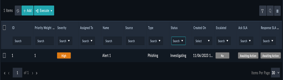
Chart Directive
Overview
The "cs-chart" directive renders charts based on selected configuration details. Users can specify chart configuration options and data to render the chart.
Selector to create a chart with selected config details - data-cs-chart
Usage
<div data-cs-chart="config"></div>

Config = {
aggregate: true,
assignedToSetting: "onlyMe",
chart: "pie",
mapping: {
  assignedToPerson: 'assignedTo',
  fieldName: 'severity'
},
query: {
  sort: Array(1),
  limit: 2147483647,
  logic: 'AND',
  filters: Array(1),
  aggregates: Array(4)
},
resource: "alerts",
showTabularData: false,
title: "Open Alerts By Severity",
wid: "f9eb224f-b6bb-4480-a5df-f43dc0ab6d5d",
widgetAlwaysDisplay: true
}
Arguments
| Parameters | Definition | Data Type |
| data-cs-chart | Adds chart configuration details to a widget.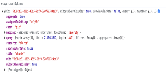 |
[Array<Object>]
|
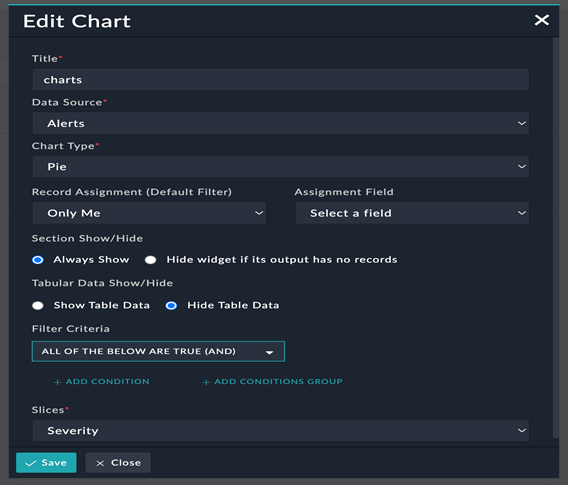
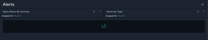
Example
An example of a rendered chart:
Focus Directive
Overview
The "data-cs-focus" directive sets focus on an HTML DOM element when applied to that element. This enhances the user experience by automatically focusing on specific form fields or elements.
Selector to focus on an HTML DOM element - data-cs-focus
Usage
<input type="text" id="filename" name="filename" class="form-control" data-ng-model="title" data-cs-focus required>
Arguments
| Parameters | Definition | Data Type |
|---|---|---|
| data-cs-focus | An attribute directive for adding focus to an HTML element. |
Example
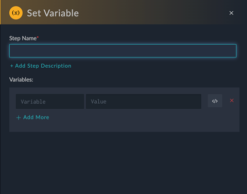
To create a focus on the HTML element, i.e. stepName:
<input id="stepName" type="text" class="input-sm form-control" name="stepName" data-ng-model="stepSelected.name" data-cs-focus data-ng-required="stepSelected">
The above snippet is used to display a dialog in which the 'Step Name' field is in focus:
Card Directive
Overview
The "data-cs-card"directive displays data as a card in the widget.
Selector to create cards used to display data - data-cs-card
Usage
<div data-cs-card data-ng-model="record" data-size="config.size" data-mapping="config.mapping" data-actions="actions"></div>
Arguments
| Parameters | Definition | Data Type |
| data-ng-model (Required) |
Used to display data in a card format. | Array<Object>
|
| Size (Required) |
Used to define the size of the card widget. | string |
| data-mapping (Required) |
Used to define the list of fields to be displayed in the card widget. | Array<Object>
|
Pagination Directive
Overview
The "data-cs-pagination" directive adds pagination to grids or pages.
Selector to add pagination on grids or pages - data-cs-pagination
Usage
<div class="search-pagination"
	data-ng-hide="pagedCollection.filters.q.length === 0 || pagedCollection.filters.index.length === 0"
	data-cs-pagination data-ng-model="pagedCollection">
</div>
Arguments
| Parameters | Definition | Data Type |
|---|---|---|
| data-ng-model (Required) |
Used to display data on the page where pagination is to be applied. | Array<Object>
|
Datetime Grid Directive
Overview
The "data-cs-datetime-grid" directive adds datetime functionality to a grid.
Selector to add datetime to a grid - data-cs-datetime-grid
Usage
<div data-cs-datetime-grid="::field"></div>
Tags Directive
Overview
The "data-cs-tags" directive adds tags to a specified module. Tags are useful for categorizing or labeling items within an application.
Selector to add tags to a specified module - data-cs-tags
Usage
<div class="cs-tags-container padding-left-sm padding-right-sm">
	<div data-cs-tags="tagsField" cs-allow-add-tag="false" data-change-method="tagsChanged" data-ng-model="item.value.tags"
	data-placeholder="tagsPlaceholder" class="position-relative width-100pt">
	</div>
</div>
Example
To add tags:
<div class="cs-tags-container">
	<div data-cs-tags="tagsField" cs-allow-add-tag="false" data-change-method="tagsChanged" data-ng-model="input.recordTags"
	data-placeholder="tagsPlaceholder" class="position-relative pull-left">
	</div>
</div>
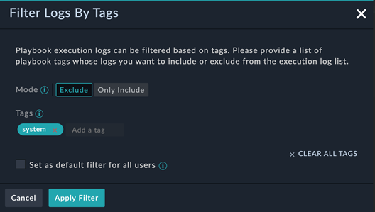
Example of the 'Filter Logs by Tags' dialog using the 'tags' directive :
Markdown Editor Directive
Overview
The "data-cs-markdown-editor" directive embeds a markdown editor in the DOM, enabling users to create and edit markdown content in a user-friendly manner.
Selector to add tags to embed markdown editor in DOM - data-cs-markdown-editor
Usage
<div data-cs-markdown-editor data-mode="'view'" data-ng-model="task.description"
data-form-name="'task-' + $index"></div>
Example
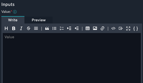
Example of the Value field that using the markdown editor directive to allow users to add or edit content using markdown:
Spinner Directive
Overview
The "data-cs-spinner" directive displays a spinner while data is being processed or fetched. This enhances the user experience by indicating ongoing operations.
Selector to add a spinner- data-cs-spinner
Usage
<cs-spinner data-ng-show="processing"></cs-spinner>
Example
Unique Directive
Overview
The "data-cs-unique" directive checks if a given value is unique within a specified context or dataset, allowing for uniqueness validation on input fields or elements.
Selector to check if the given value is unique or not- data-cs-unique
Usage
<input id="variableName" type="text" class="input-sm form-control" name="variableName" data-ng-model="dynamicVariable.name"
data-ng-pattern="varRegex" data-cs-unique="dynamicVariablesNameList" data-cs-focus required>
Arguments
| Parameters | Definition | Data Type |
| data-ng-model (Required) |
Used to display data in the widget. | string |
| data-cs-unique (Required) |
Used to specify the list of data in which uniqueness needs to be checked. | Array<Object>
|
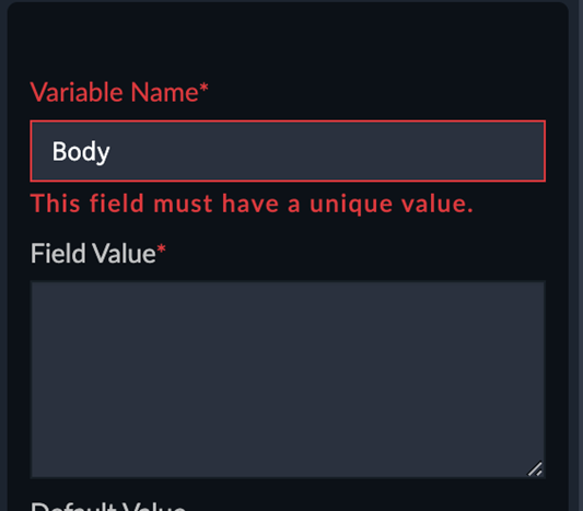
Example
Example of the Variable Name field using the unique directive, indicating that the value specified in this field must be unique: